On the road to Concord, three Black men in a wagon make a daring escape
It had rained that day in Boston, and now, even though the moon was full, there was little light in the sky as three men left Cambridge and headed for Concord. No, it wasn’t the midnight ride of Paul Revere, but another of unusual significance. For riding in a dark wagon was a fugitive from justice and two conspirators, unwilling to let another human being be returned to slavery. It was Saturday, Feb. 15, 1851.
The morning had started out as any other. Shadrach Minkins, a waiter at the Cornhill Coffee Shop in Boston, had put on his apron and started work. What he didn’t know was that he would soon become a test case for the Fugitive Slave Act, a law enacted by Congress to keep Southern states from bolting. The story has been told beautifully by Gary Collison in his book, Shadrach Minkins: from Fugitive Slave to Citizen, from which I have drawn here.
Born into slavery in the port city of Norfolk, Virginia, Minkins had worked for various masters, having been sold three times. In the spring of 1850, around 30 years of age, he disappeared, escaping most likely as a stowaway on a merchant ship headed north. Arriving in Boston, he joined a community of some 2,500 free blacks and former slaves. Considered a haven for those seeking their own emancipation, Boston would soon become the focus of federal agents and bounty hunters.
Mandating the return of all former slaves to their owners, the Fugitive Slave Act imposed stiff penalties of imprisonment and fines to anyone sheltering fugitive slaves. Further, state governments, local law officers, and even citizens were called on to aid in its enforcement.
If Minkins could be arrested in Boston, the hub of the abolitionist movement in the North, and returned to his owner, Southern states would see that Washington was protecting their interests, muting talk of succession. Even President Millard Fillmore and Secretary of State Daniel Webster had approved Minkins’ capture.
Enacted in September of 1850, the Fugitive Slave Act divided families, towns, political parties and churches. As most governors, legislators, and clergy fell in line with the law, New England abolitionists voiced their opposition. In Boston, the Vigilance Committee, made up of Black and white abolitionists, warned of arrests and planned counter measures.
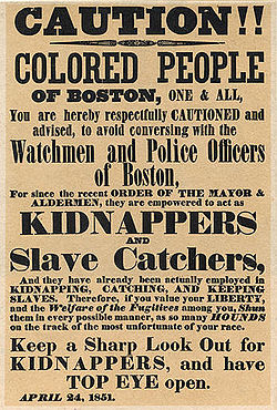
Now, as Minkins waited tables in the restaurant, a federal marshal and eight officers took up positions outside the restaurant. After a considerable delay, waiting for the man who would identify their suspect, the marshal and one of his men entered the restaurant and ordered coffee. They were served by a “stout, copper-colored man,” no other than the fugitive they sought, writes Collison.
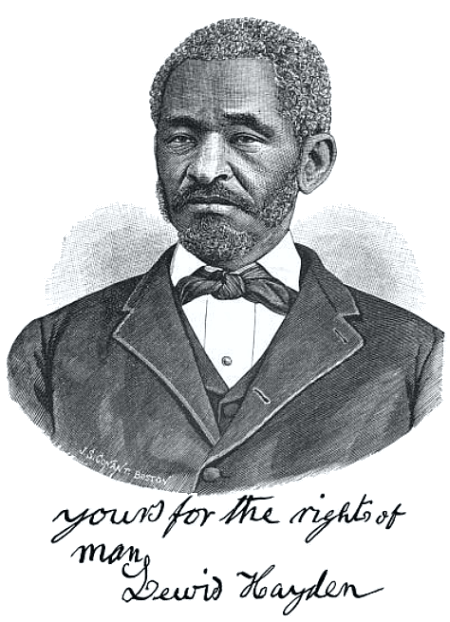
When Minkins took the marshal’s payment to get change, two officers grabbed him under the arms, rushed out a back door and dragged him into the Court House, a block away. They had been seen, however, and word quickly spread. Within minutes a crowd of abolitionists and onlookers filled Court Square. One of them was a former slave from Kentucky, Lewis Hayden, now a clothing merchant and owner of a boarding house on Beacon Hill.
For several years, Hayden had been owned by Henry Clay, the senator and future architect of the Fugitive Slave Act. After seeing his siblings, then his wife and child sold, Hayden had fled with his second wife and her son to Philadelphia, then on to Canada. In 1846 Hayden brought his family to Boston. Lewis and Harriet Hayden became leaders in the abolitionist community, and their home on Southac Street a station on the Underground Railroad.
As Shadrach Minkins awaited arraignment, abolitionists packed into the stairway and hallway outside the upstairs courtroom. After the judge arrived, federal officers presented evidence that the suspect was in fact a fugitive from Virginia and the property of a Norfolk businessman.
Meanwhile, the crowd inside and out became more agitated. Defense attorneys, including Richard Henry Dana, Jr., presented petitions for Minkins’ release. When they were denied, black activists led by Hayden forced their way into the courtroom, surrounded Minkins and carried him “by the collar and feet” out to the street. Then, mixing in with the crowd, Hayden and Minkins scurried off towards Charles Street.
Turning quickly into a side street, Hayden took Minkins to the widow Elizabeth Riley, who hid him in her attic. Returning after dark, Hayden then took Minkins across the bridge to Cambridge and the home of the Rev. A. J. Lovejoy. HHe knew, however, that the fugitive could not stay there for long.
Later that night, Hayden returned to the minister’s home. This time he came in a wagon drawn by two horses, one black and one white. The wagon was driven by John J. Smith, a barber and fellow abolitionist. Picking up Minkins, they headed west.
My guess is Hayden and Smith, dressed in oil-cloth and sou’esters, sat up front, while Minkins lay covered by a tarpaulin in the bed of the wagon. They may have traveled on the Concord Turnpike, which was the most direct route, but which had several steep hills. Or they may have taken the old route through Lexington along Battle Road to Concord. Perhaps the rain had stopped by then and the moon was penetrating the cloud cover with faint light. Given the muddy roads, it must have been slow going.
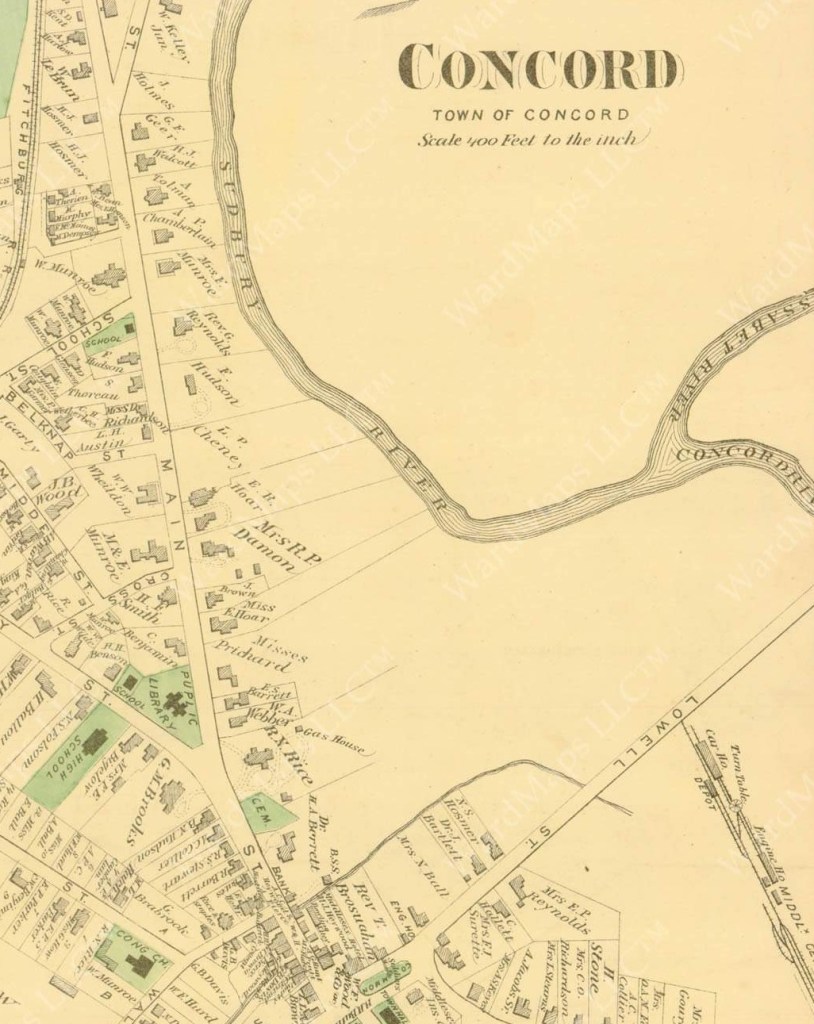
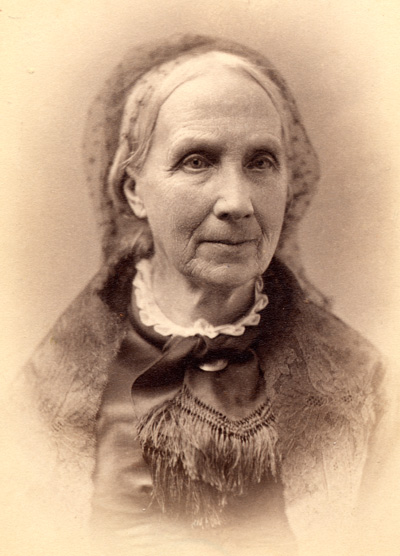
About 3 a.m. Smith turned the horses onto Main Street in Concord. Proceeding through the sleeping town, they then angled left onto Sudbury Road and entered the yard of the blacksmith, Francis Bigelow. Hearing the wagon, Francis got out of bed and went to the door. Francis’ wife, Ann, who was unwell, may have looked out the upstairs window, for it was she who noted the color of the horses. Years later, Ann would tell the story to Edward Waldo Emerson, Harriet Robinson and others, accounts found in the Concord Free Public Library.
“Mr. Bigelow, hearing the carriage, opened his door, and let in the poor fugitive [and his escorts], though the penalty was a thousand dollars, and six months’ imprisonment, for ‘aiding and abetting’ a slave to escape. The blinds of the house were at once shut, and the windows darkened, to evade the notice of any passers-by.”
As Ann told it, the Bigelows then warmed the fugitive and brought him into their own bedroom, where Ann served breakfast, using the bureau for a table. Minkins, worn by anxiety and lack of sleep, could barely keep his eyes open. Meanwhile, the Brooks, sympathetic neighbors, arrived.
After Minkins had eaten and rested, Francis found him warm clothes, but had no hat his size. But Nathan Brooks did. He promptly left and returned with “a hat of his own with which to disguise himself—the hat of a law-abiding citizen!”
Before dawn, Francis Bigelow led Minkins to his own wagon outside, and the blacksmith and fugitive drove west again, this time to a safe house in Leominster. From Leominster, Minkins was transported to Fitchburg, where he boarded a train to Montreal.
For Minkins the flight to Canada was a continuation of a life in exile. Separated from his family in Virginia, he joined a small community of former slaves in Montreal. He got a job as a waiter, saved his money and opened his own restaurant. Later, he set up a barbershop.
Over time, he married, and had four children. He never returned to the United States. He was the first runaway slave arrested in Boston under the Fugitive Slave Act, but not the last.
Meanwhile, Minkins’ rescuers returned to Boston. As Ann Bigelow recalled: “Mr. Hayden and Mr. Smith drove leisurely to Sudbury, stopped with friends there, went to church, and, after a good dinner, returned unmolested to Boston.”
Hayden did not, however, escape prosecution. One of several abolitionists charged with aiding and abetting Minkins’ escape, Hayden was acquitted after a jury—which included none other than Francis Bigelow himself—would not convict.
For years after, Lewis and Harriet Hayden continued their militant opposition to the Fugitive Slave Act, hiding and transporting fugitives and raising money. Lewis joined the black Masonic lodge created by Prince Hall, and later served in the state legislature. He also led a successful effort to integrate Boston schools and campaigned for women’s rights.
During the Civil War, Hayden helped to convince his friend, Governor John Andrew, to form a black regiment and actively recruited soldiers for the Massachusetts 54th.
Today, you can visit the Hayden home, a site on the Black Heritage Trail on Beacon Hill. And in Concord, you can still find the house on the Underground Railroad, where the Bigelows opened their doors to Shadrach Minkins and his escorts 172 years ago.
Note: This story first appeared in the magazine, Discover Concord, Summer 2024, as “A Midnight Stop on the Underground Railroad.”